From our resident millennial and social media guru, Jordan Stothers
Just call me Dr. Meredith Grey, because I’m about to give you your first anatomy lesson. Oh, but don’t worry, there will be zero blood and guts involved – today we’re examining the anatomy of a Pinterest pin!
Pinterest has become an incredible tool to help with driving traffic to your site. Whether you’re a blogger, shop owner, or a leader within your industry, crafting effective Pinterest posts can help increase brand exposure and site traffic. When it comes to Instagram and Facebook, your posts have a short shelf life. You may get a ton of likes the first day, but after 24 hours, engagement drops off. Pinterest, on the other hand, is all about people searching for pins, and re-pinning! This creates a snowball effect with very little long-term effort on your part.
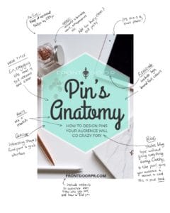
So what exactly is the anatomy of a pin? Here’s the one I created especially for this post. Read below for a breakdown of all its parts:

#1 Pin Size:
First off, no squares!! Longer is better. Just make sure it’s not too long or it will be cut off in the feed, and also be sure not to over-stretch your photo. The ideal pin size is 565px X 1184 px, and Pinterest recommends 600px X 900 px.
#2 Text:
Mix and match fonts for a fun look that evokes a feeling and grabs attention. Keep in mind what your brand aesthetic is, and use fonts that still tie into your business/blog look. If you already have a custom font that you use for your business, feel free to stick with that!
#3 Image
Not a photographer? Don’t worry! There are loads of stock photo websites where you can download relevant and interesting photos – often for FREE! All you have to do is try to find a stock photo that makes sense with what you are pinning about. For example, if you want to promote a blog post about delicious recipes, look for something to do with food or a kitchen.
#4 Watermarking:
Because pins are constantly re-pinned, it’s a good idea to have clear and visible branding that can still convey who you, your brand, and your business are. Incorporate your logo, business name, and/or the website you’d like to drive traffic to. Millennial tip – leave the ‘www’ out of your website. It’s unnecessary and will make your pin look cluttered.
#5 Title & Hook:
Is there a particular blog, idea or service you’re providing? Come up with a slogan, call to action, or even incorporate the blog title if it’s short enough. This will help to clearly communicate what you’re advertising for, and help potential pinners understand what it is without giving away too much information. You want them interested just enough that their curiosity is peaked, and they want to learn more. This is your chance to hook them!
#6 Posting your pin:
Make sure to add the URL of the page you want your pin to redirect to. There are two options for this. You can add the URL directly to the specific product/service/blog post, or you can always link back to your main business page. It depends on where you want traffic to go.
#7 Description:
Don’t forget about this! This is where you really want to sell your pin to your audience. Use a mix of SEO keywords to help increase your chances of the pin being found in Pinterest searches, but be sure to write your description naturally instead of just typing a string of words.
#8 Boards:
Pin to a relevant board with similar posts. Try to be more creative than just posting to your ‘My Business’ board. This will allow Pinterest to understand what your pin content is, and how to recommend it when people search.
So there you have it – the anatomy of a successful, eye-catching pin. Now that you know the basics, it’s time for YOU to go out and make your own. Be sure to share them with us when you’ve pinned them!


